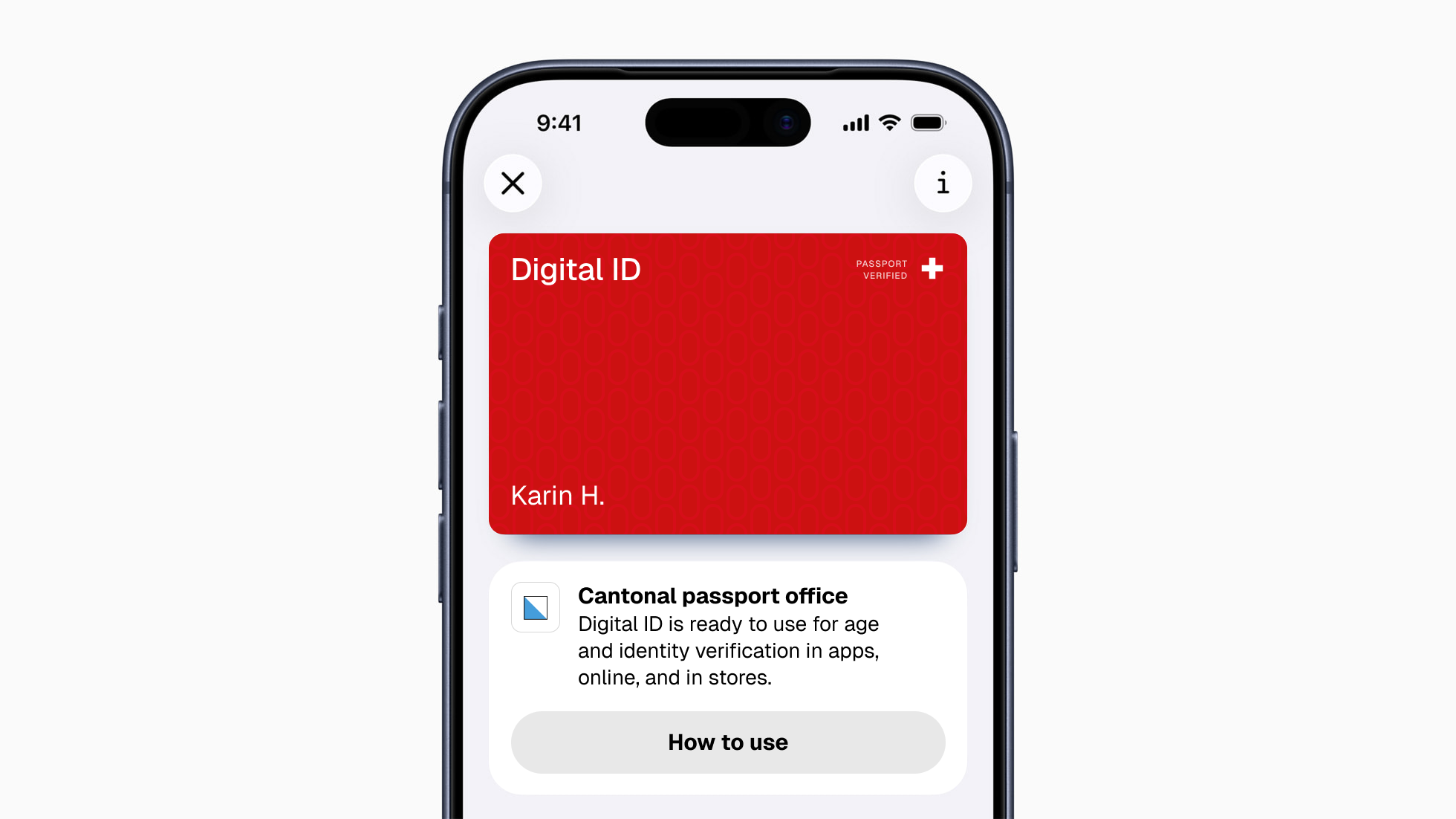
I used to believe that good design meant removing friction: fewer decisions, fewer clicks, less complexity. Working on a national digital identity initiative challenged that belief. The product was shaped by technical architecture, regulation, accessibility, security, political scrutiny and public trust. Usability mattered, but it was never the only goal. Because the project is confidential, names, interfaces and implementation details have been generalised. The design questions and lessons are authentic.
About
Most product problems are coordination problems. Teams that cannot agree on what they are building, or why, or for whom. I have spent over 15 years solving exactly that, by creating the structure, systems, and shared language that let engineers, PMs, and executives make better decisions together.
Currently working as a UX Design Expert at an IT and engineering consultancy, embedded in client projects across enterprise software and native mobile.
More about meSelected Work
As part of my work at ELCA Informatics, I audited the design token foundation behind a complex design system: mature Android, iOS, and global token libraries already in active use. The libraries had grown in ways that made them hard to verify with confidence. Scopes were broad or inconsistent, descriptions were incomplete or missing, naming had small inconsistencies, and changelog structures differed from library to library. For a human designer, most of that was manageable. For an AI-supported workflow, where the agent can only reason reliably about what the system exposes clearly, it was a blocker.
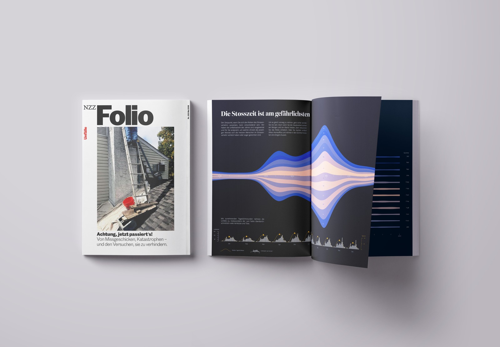
As part of my studies in data visualisation at Bern University of Applied Sciences, I was commissioned to take on a self-directed visualisation project. I chose 25 years of Swiss road traffic accident statistics: dense, multidimensional, and covering a subject serious enough that it deserved more than a headline number. The initial dataset from the Federal Statistical Office, Master I, was too coarse to work with: accidents were only logged in six-hour blocks, without victim counts. After repeated follow-up requests to the federal roads office, I got access to Master II, an hourly dataset with counts by injury severity, which is what made the later hour-by-hour and weekday visualisations possible at all. Both datasets already followed Wickham’s tidy-data principle, so no cleanup was needed. But they still had to be reshaped from wide into stacked/narrow form before the visualisation tool I settled on could use them, and I built several derived sub-datasets from the two master sets as the direction of the series became clearer.
eGB, the electronic land registry, is the specialised application that notary offices across the municipalities of the canton of Zurich, and the cantonal land registry offices, use to manage legally binding land register entries: ownership, liens, easements, annotations. I was brought on as lead UX designer to renew the application, covering the UX concept, screen design, and the ongoing collaboration with engineering through implementation. My role spanned the full arc of the work: building the UX concept and screen designs, consulting directly with the client’s subject-matter experts, and staying involved through implementation rather than handing off a set of screens and moving on.

Open System was growing. As the business evolved, keeping a coherent, high-quality experience across the interfaces of Mission Control, the company’s network security platform, was becoming harder to sustain. Each new feature arrived with its own interpretation of basic visual decisions, because there was no shared foundation to work from: no documented color system, no agreed component behaviour, no shared design principles.
Open System’s Mission Control platform gives customers, mid-size and large enterprises among them, visibility into their own network security and traffic data as part of a managed service. As UX Design Lead, I owned the full customer-facing experience: the dashboard family customers rely on daily, and Atlas, the dedicated tool for exploring global WAN topology and traffic in depth. Both were the primary way a customer’s own team could see what Mission Control was actually doing for them, so the experience had to work as one coherent product, not a dashboard and a separate analytics tool that happened to share a login.

Engineers at Open System run Mission Control, the company’s network security platform, around the clock. Each engineer is scheduled across a defined set of shift types: morning, afternoon, weekend, holiday. Every month’s plan is published so the team can see their shifts and trade them directly with each other. The existing tool had accumulated logical bugs, but the deeper problem was an experience that gave engineers no confidence in what they were actually agreeing to.
Expertise
Enterprise software & complex B2B
I design for products where the stakes are high and the workflows are intricate: internal tools, operations platforms, and B2B applications used by people who cannot afford a wrong click.
Mobile, iOS & Android
Native mobile design across both platforms, with a strong understanding of platform conventions, gesture-based interaction, and designing for users on the move.
Design systems & component libraries
I build the foundations that let teams ship coherently at scale: token systems, component libraries, contribution guidelines, and the documentation that makes it all maintainable.
User research & discovery
From research planning and moderated interviews to synthesis and insight reports, I turn what users actually do and say into decisions the whole product team can act on.
Stakeholder management & design leadership
I work at every level of the conversation, with engineers, PMs, and C-suite. I bring structure to ambiguous briefs, facilitate alignment, and represent design where it matters most.
Data visualisation & information design
I turn dense, multidimensional data into visual forms that reward attention: stream graphs, dot matrices, and custom encodings built for the reader, not just for accuracy. From raw datasets to editorial pieces designed to be read like a story, not scanned like a report.
AI in the UX process
I use AI throughout the design system and prototyping process. That means building and maintaining design tokens with AI assistance, structuring design systems to be machine-readable so they stay usable as AI becomes part of how products get built, and implementing working prototypes directly in code with tools like Claude. AI accelerates execution; the structure and judgment behind it stay mine.
Contact
Let's talk.
Open to connecting around complex UX challenges, product strategy, and selected collaborations.